Portfolio
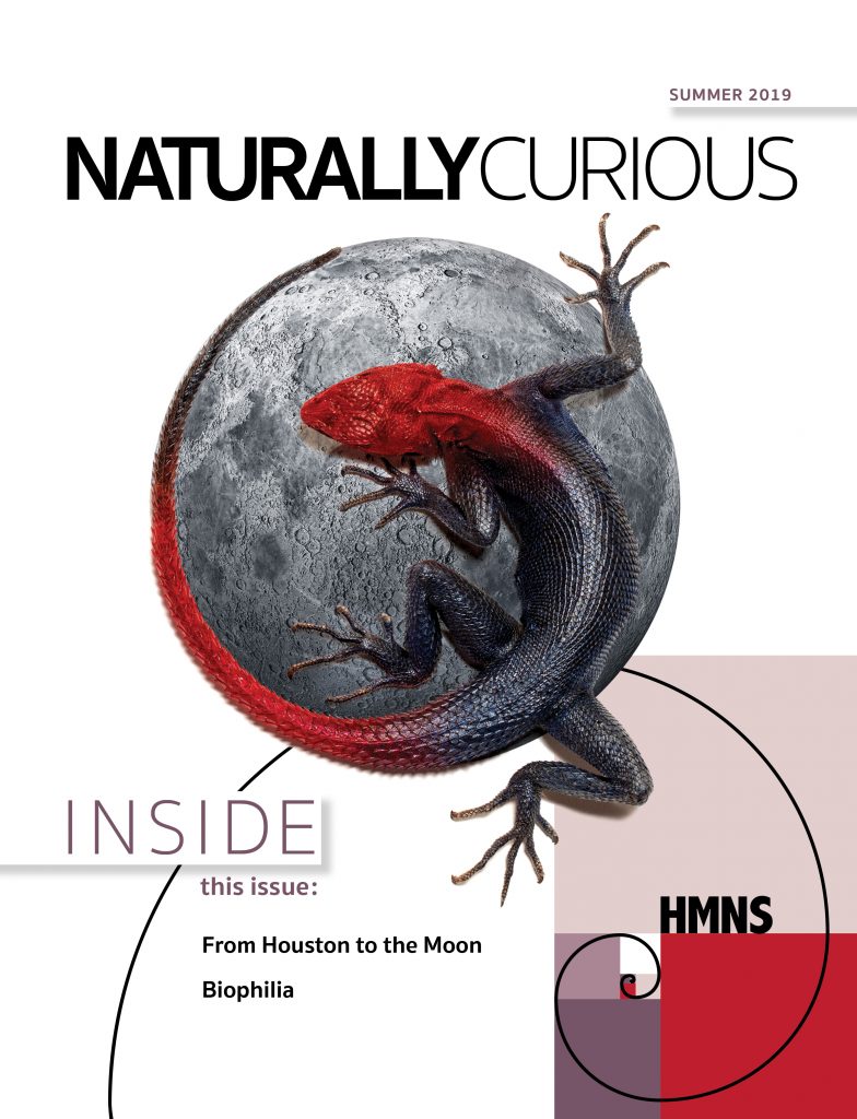
Magazine
In 2019, The Houston Museum of Natural Science decided to launch a quarterly publication to further engage museum donors, members and sponsors. Naturally Curious features in-depth stories about upcoming exhibits, educational programs, artifact acquisition, staff personalities and much more. I was solely responsible for the look and feel of the magazine, including all design and production.
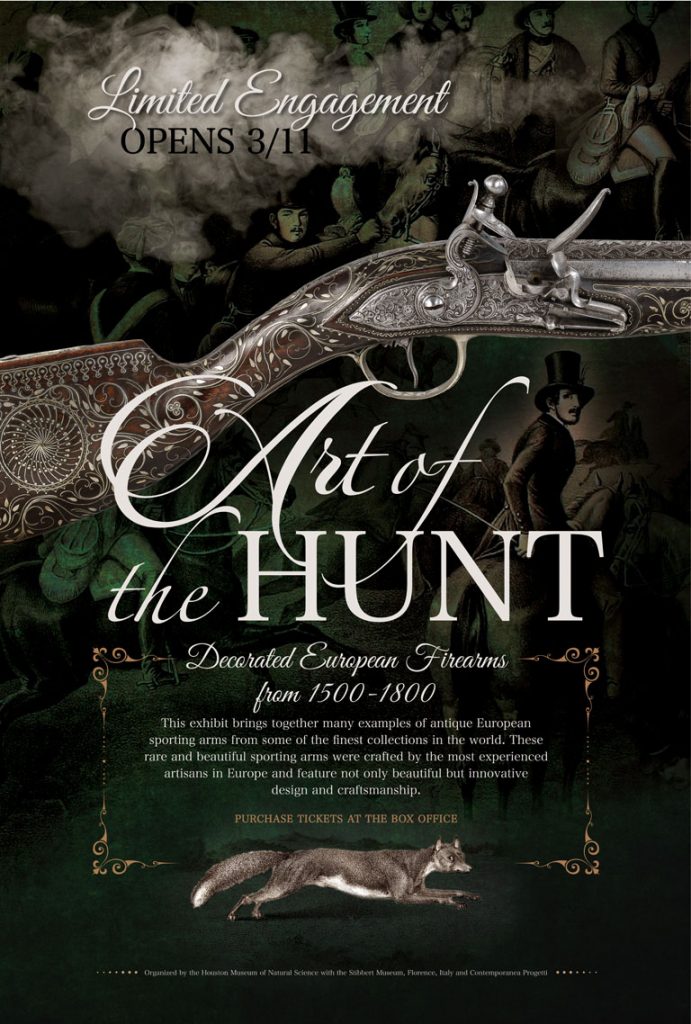
Posters
The entrance and interior at HMNS features “marquee-type” posters that promote new exhibits, promotions, member events and a variety of programs. Included here are a few examples chosen from hundreds of posters designed over the years.
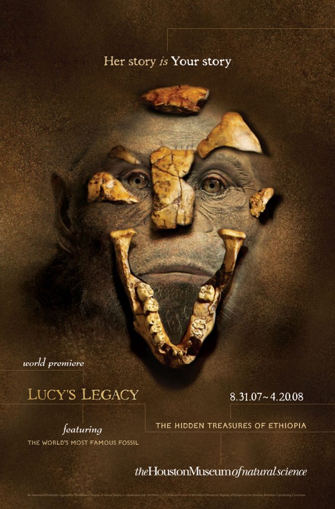
Advertising
The Houston Museum of Natural Science is a well-known brand in the fourth largest market in the U.S. The museum promotes a wide variety of national and international-touring exhibitions which are individually branded to appeal to Houston’s unique market and audience. “What’s New?” advertising has proven to be more effective in driving attendance, membership, donors and sponsorships than traditional institutional campaigns.
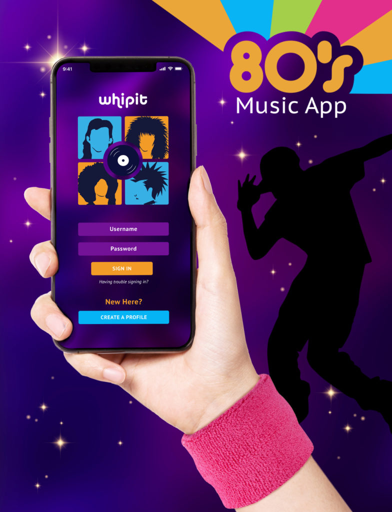
UX/UI Design
Introducing my latest creations as a new member of the digital movement. While UX/UI disciplines may seem relatively new to a seasoned graphic designer like myself, I believe the core principles of UX/UI design reflect those of a traditional brand strategy. It all begins with a customer, the user. What does the user want, what does the user need to solve a problem and how will the UX/UI Designer provide a solution?
In this section I have showcased a variety of case studies of both native and responsive apps including both UX and UI methodology.

Logos
Logos or type treatments are in high demand in an organization where many programs are a “one off” and temporary. Typographic design is a muscle I’ve flexed plenty of times throughout my career. Included here are just a few examples.
Collateral
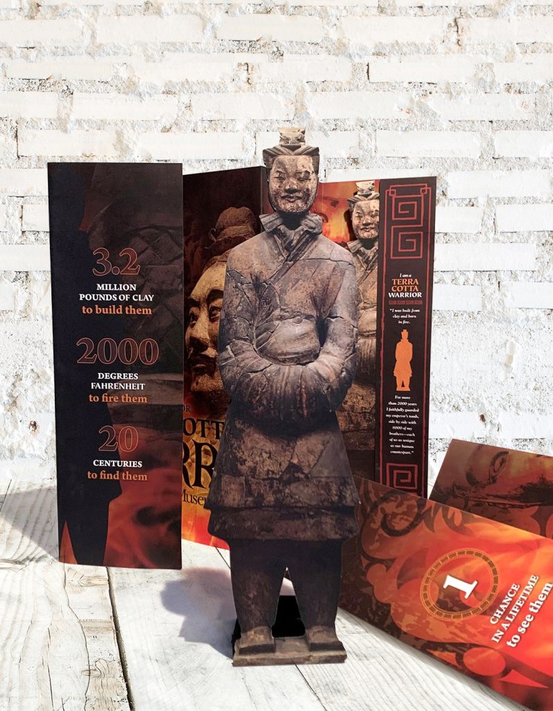
Event invitations, solicitation packages, promotion materials, packaging…I consider these my paper playground. It takes creativity, the element of surprise and the ability to think outside the box, oftentimes with small budgets. My goal is always to make the collateral piece so enticing, it would be difficult to throw it away. I like to imagine someone cleaning out their keepsake box someday and stumbling upon one of my creations and smiling. These pieces thrive in a tactile environment. I’d love for you to experience them in person…
and see YOU smile!
Clipart Wizardy
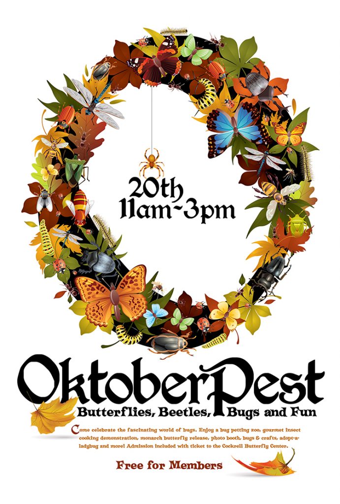
The use of illustration is one of my favorite ways to solve a challenge. Oftentimes budgets are limited and no images exist to build a campaign—but the standards are still high. “Can you use clipart?” Ever heard this before? Included here are few of my favorite projects when clipart was the only option.
